Farmhouse decor’s absolutely still thriving in 2026, but this is the thing—it’s evolved. The cookie-cutter farmhouse aesthetic you saw everywhere five years ago has matured into something called modern cottage style. It’s more intentional now, focusing on authentic antiques, warm neutrals like cream and camel, and curved furniture instead of hard edges. You’re trading mass-produced pieces for meaningful items that tell your story. Stick around to discover exactly how to refresh your space.
Yes, Farmhouse Is Still Popular: But It’s Evolved
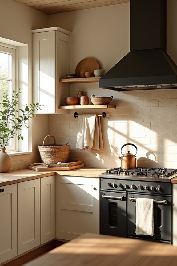
So, is farmhouse decor still having a moment in 2026? Absolutely—but here’s the thing: it’s looking different than before.
Farmhouse decor endures in 2026—but it’s evolved into something more authentic and intentional than before.
I’ve noticed the shift myself. We’re moving away from that cookie-cutter farmhouse aesthetic toward something more personal and intentional. Modern farmhouse now celebrates authentic materials like reclaimed wood and vintage finds instead of mass-produced replicas. It’s less about cramming in every trendy piece and more about choosing what actually matters to you.
The color palette’s changed too. Instead of stark whites everywhere, I’m seeing layered neutrals with moodier tones—creams, soft grays, and warm beiges working together. These deeper shades create warmth without feeling commercialized.
What makes farmhouse stick around isn’t following trends blindly. It’s about creating spaces that tell your story and feel genuinely lived-in.
How Modern Cottage Evolved From Farmhouse
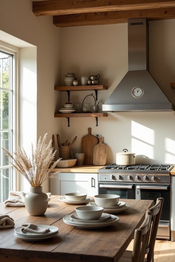
While farmhouse gave us the foundation, modern cottage’s taking over in 2026—and it feels like the style finally matured.
Here’s what changed:
- Moody tones replaced stark whites – We ditched the super-bright aesthetic for richer, warmer colors that work better in lived-in spaces
- Antiques became intentional – Instead of filling rooms, we’re choosing one truly old piece per room for depth and history
- Layered neutrals won – Think soft beiges, creams, and warm grays working together instead of boring sameness
- Curved lines softened everything – Say goodbye to rigid farmhouse edges; curves feel more personal and collected
The shift celebrates a mix of old and new items that tell your story. Modern cottage isn’t about perfection—it’s about warmth, defined spaces, and textiles that draw you in. You’re building a home that actually reflects who you are.
What Defines Modern Cottage Style
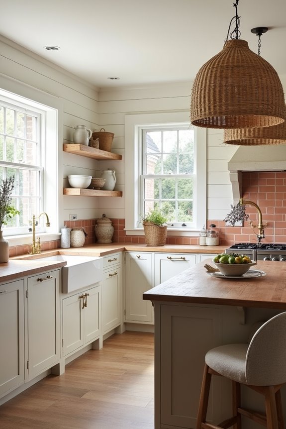
| Element | Farmhouse Style | Modern Cottage |
|---|---|---|
| Materials | Distressed wood | Natural wood + stone |
| Color Palette | Stark whites | Warm neutrals |
| Vibe | Rustic, staged | Lived-in, personal |
Modern cottage blends warmth with history. This approach mixes antiques with contemporary pieces, creating spaces that tell a personal story. Softly imperfect finishes are deliberate choices. Curved lines replace sharp edges. Warm taupes, creams, and mushroom tones create comfort throughout. The result is a home that evolves with its inhabitants, prioritizing storytelling and authenticity over trends.
How to Swap Hard Lines for Curves
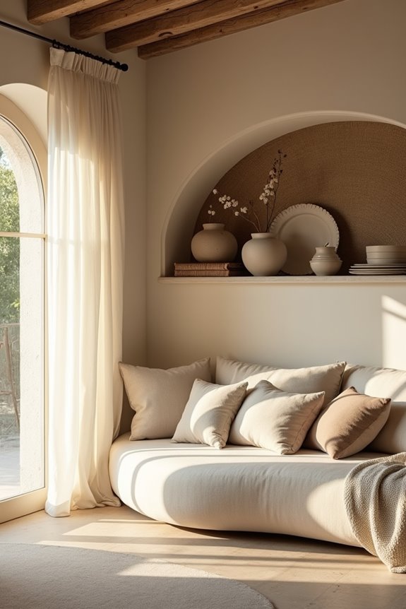
Ever notice how a room with all sharp corners feels a bit harsh, even when it’s decorated beautifully? Swapping hard lines for curves changes how a space functions and feels. Modern cottage style thrives on this softer approach, and it’s easier to achieve than you’d expect.
Here’s what works:
- Replace angular coffee tables with rounded ones to soften your seating area
- Add barrel chairs that invite you to sink in comfortably
- Install arched doorways or mirrors to guide your eye smoothly through rooms
- Layer curved furniture with vintage pieces for a collected, balanced appearance
Pair these curved elements with warm neutrals—creamy whites, soft greiges, mushroom tones—and you’ve created a space that feels inviting. Your room will benefit from the shift.
Warm Up Your Color Palette With Creamy, Soft Neutrals
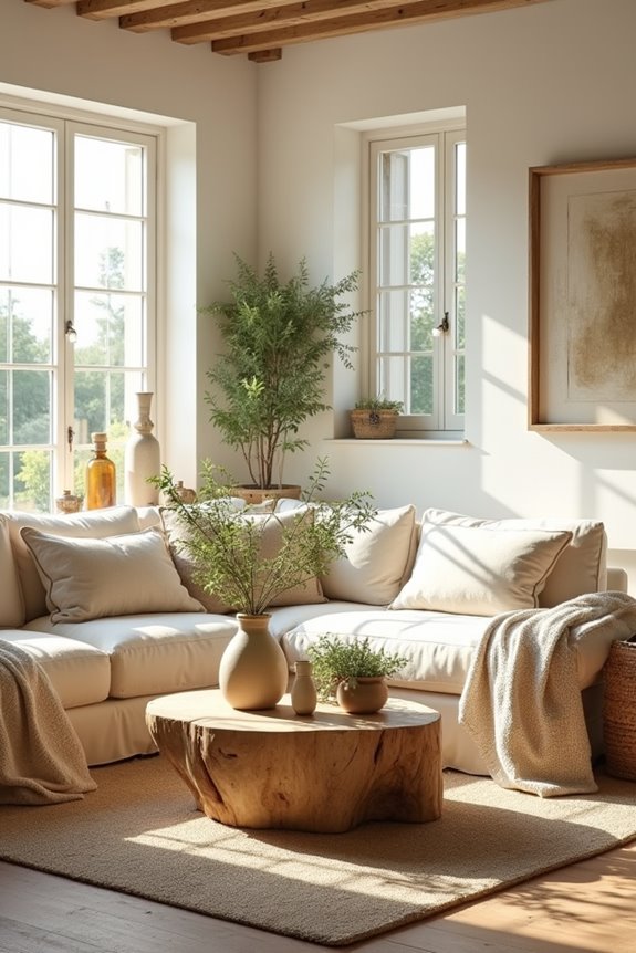
The appeal of modern cottage style lies in curved furniture and vintage finds—but equally important is the colors you choose to surround yourself with. Warm neutrals work well for creating spaces that feel comfortable and lived-in.
Think creamy whites, soft greiges, and oatmeal tones. These aren’t boring—they’re reliable anchors. Here’s what I do: I layer textures across at least three distinct neutral color options. A mushroom-toned sofa pairs beautifully with flax linen curtains and a taupe accent wall. This layering textures approach adds depth without feeling cold or sterile.
The benefit? These warm neutrals balance darker, moodier accents effectively. They let vintage pieces exist naturally while keeping everything looking intentional and personal, not overly styled.
Why Antiques Are Taking Center Stage in 2026
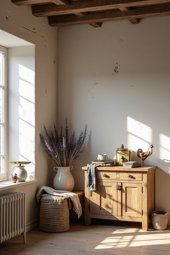
What’s happening in farmhouse design right now? We’re ditching fast furniture and embracing pieces with real history. I’ve noticed antique storytelling is becoming essential to how we decorate.
We’re ditching fast furniture and embracing pieces with real history. Antique storytelling is becoming essential to how we decorate.
Here’s what’s drawing us in:
- Patina and imperfections tell authentic stories
- One truly old piece grounds each room with character
- Timeless pieces reflect our personal history and values
- Mixing antiques with modern lighting prevents heaviness
I’m loving how we’re pairing genuine farmhouse pieces with contemporary chairs and sleek fixtures. It’s not about filling rooms anymore—it’s about selecting meaningful items that matter to us. You’ll find that authentic antiques paired with lighter, modern elements create that collected, personal look we’re all seeking. This shift feels like coming home.
Darker, Moodier Tones Replace Stark Whites
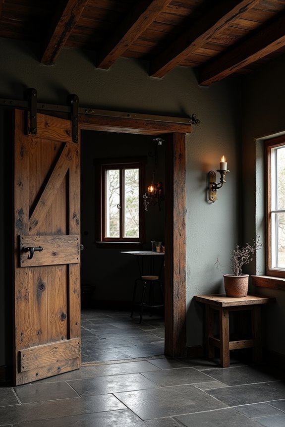
I’ve noticed the farmhouse aesthetic I loved just a few years ago—all those crisp whites and bright spaces—is shifting in 2026, and I’m embracing it. Instead of relying on pure white walls and furniture, I’m now layering in deeper colors like cognac, charcoal, and deep olive, which gives my space more personality and warmth. The approach I’ve discovered is balancing these moodier tones on lower cabinets and accents with lighter textiles and warm wood tones, so the whole room feels inviting rather than dark and heavy.
Rich Hues Dominate 2026
How’d we get stuck with all those blinding white walls anyway? I’m ditching that sterile look, and you should too. Rich hues are working hard in farmhouse decor in 2026, moving us toward spaces with actual character.
Here’s what’s working now:
- Deep browns, cognac, and tobacco create warmth on lower cabinets and furniture
- Charcoal and ink accents add personality without feeling heavy
- Deep olive tones bring nature indoors naturally
- Warm neutrals like cream and camel balance darker elements
I’ve layered these rich hues throughout my space, and honestly? It feels so much cozier. We’re embracing a lived-in aesthetic where farmhouse decor shows who we are. Your walls don’t need to whisper anymore—let them speak.
Layering Warm Neutral Tones
Remember when we all thought white walls were the answer to everything? I’m so glad we’ve moved past that. Today’s farmhouse decor embraces layering warm neutrals instead—and honestly, it feels inviting.
I’ve discovered that combining cream, camel, and taupe creates genuine coziness. The trick? Use at least three warm neutrals throughout one room via textiles, furniture, and finishes. A cream wall pairs beautifully with camel upholstery and brown wood accents. This layering approach adds depth without feeling cold or clinical.
The best part? Darker, moodier tones like cognac and charcoal now balance these lighter neutrals. I’ve started applying deeper colors to lower cabinets while keeping upper walls soft and warm.
Texturing matters too. Stone, plaster, and natural wood enhance that farmhouse feeling. When you layer thoughtfully, your space becomes personal and welcoming—exactly where you want to spend time.
Balancing Dark With Light
Now that you’ve got your warm neutrals working together, here’s where things get really interesting: adding darker, moodier tones changes everything.
I’ve discovered that this dark and light balance is what makes farmhouse decor feel current in 2026. Instead of those stark white walls everywhere, you’re layering in deeper colors that give spaces more depth and warmth.
Here’s what I’m doing:
- Paint lower cabinets in charcoal or deep olive
- Add chocolate brown furniture pieces as anchors
- Use warm neutrals on upper walls and textiles
- Incorporate cognac or tobacco accents through decor
Darker tones ground your space while lighter elements keep it open and airy. You’re creating rooms with personality, not pages from a catalog. This balance is what makes farmhouse decor feel lived-in and welcoming.
Layer Warm Neutrals for Depth and Coziness
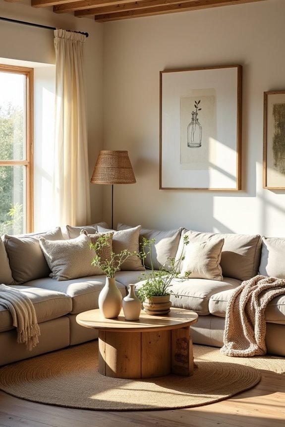
I’ve learned that layering at least three warm neutral tones—think cream, camel, and taupe—creates a cozier room than any single color alone. You’ll want to spread these tones across your textiles, furniture finishes, and even wall treatments so they work together naturally, kind of like how I finally stopped fighting my instinct to mix and match. The trick is picking complementary pairs like cream plus camel or taupe plus warm wood, which sounds simple but honestly matters between a space that feels inviting and one that just feels flat.
Cream and Camel Combinations
Most of us have walked into a room painted entirely in stark white and felt cold. That’s where cream and camel combinations work well. Layering these warm neutrals creates a space that feels comfortable and lived-in.
Here’s what works best:
- Paint walls in soft cream as your base
- Add camel-toned furniture pieces for warmth
- Layer in cream textiles like throws and pillows
- Mix in natural wood to tie everything together
When I combined a cream sofa with camel curtains and cream area rugs, the room became more cohesive. It wasn’t bland—it felt deliberate and welcoming. You’re creating depth without relying on bold colors. This approach lets natural materials stand out while wrapping your space in genuine comfort.
Textiles for Warmth and Texture
Why do some rooms feel wrapped in comfort while others leave you wanting to put on a sweater? The answer lies in layering textiles strategically.
I’ve discovered that combining rugs, throws, and upholstery in warm neutrals creates a comfortable retreat. Think cream area rugs anchoring your seating, camel throw blankets draped over chairs, and taupe cushions scattered across sofas. These layers work together, creating depth without clutter.
Texture combinations matter too. A linen throw pairs beautifully with a wool rug. Cotton upholstery complements a chunky knit blanket. Each textile adds tactile interest while maintaining that farmhouse warmth most people appreciate.
Start with three different warm neutral tones in your textiles. You’ll notice the difference—and so will your guests.
Three Neutrals Per Room
Now that you’ve got your textiles working together, here’s the approach that’ll tie everything into one cohesive room: the three-neutral rule.
I discovered that layering warm neutrals builds depth in spaces. You’re not picking one beige and calling it done. Instead, you’re creating layers that work with purpose. Here’s what I do:
- Choose your base (cream or linen)
- Add a mid-tone (taupe or camel)
- Layer in a deeper shade (brown or chocolate)
- Mix through textiles, furniture, and finishes
This farmhouse decor approach prevents that flat, boring look. When I accumulated three warm neutrals across my reading nook—cream walls, camel throw, brown wood furniture—everything came together. The room felt organized and balanced. You’re building a space through color that works for you.
Curated Spaces Win Over Cluttered Rooms
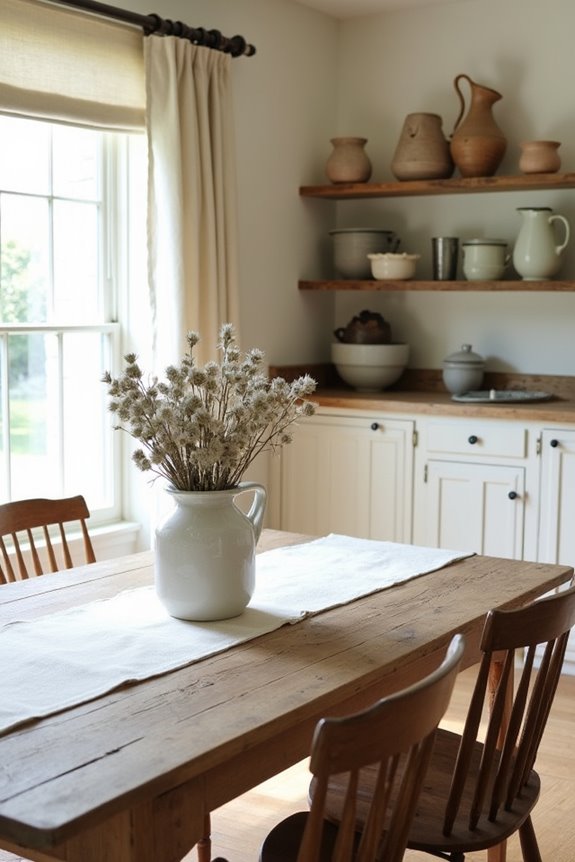
When’s the last time you walked into a room and felt instantly calm instead of overwhelmed?
That’s what happens with thoughtfully arranged spaces. Instead of filling every corner, I’ve learned to display only items I genuinely love. A few meaningful pieces—maybe a vintage ladder mixed with modern shelving—tell my story better than dozens of mass-produced decor items ever could.
Farmhouse charm works when you’re selective. I keep my warm neutrals on purpose. Each object earns its place. That old wooden table? It stays. The impulse buy gathering dust? It goes.
Your home shouldn’t feel staged or sterile. Let rooms evolve naturally as your life changes. Display what matters. Mix old treasures with contemporary pieces. Curated spaces have room to breathe. They welcome you home because they’re truly yours, not replicas from someone else’s vision.
Open Concept Out, Defined Spaces In
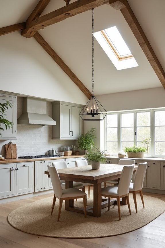
a reading nook with good lighting, a work zone away from distractions, a gathering spot for conversations. Instead of one massive room that tries to be everything (and honestly ends up being nothing), you’re intentionally designing each space to do its job well.
Purpose-Driven Room Design
Why do so many of us end up with living rooms that feel like everything happens everywhere?
I’ve been there too. That’s why purpose-driven design is changing how we think about our homes in 2026. Instead of cramming multiple functions into one space, I’m creating distinct rooms for specific activities. Here’s what I’m focusing on:
- Reading nooks with wooden beams and soft lighting
- Gathering spaces for family conversations
- Working areas separated from relaxation zones
- Resting rooms designed for genuine rest
This approach is deliberate. I’m layering cozy cottage tones throughout, choosing warm neutrals that make each space feel distinctly mine. Rather than generic store-bought furniture everywhere, I’m selecting pieces that tell my story. Purpose-driven design means I’m finally honoring how I actually live. It works well.
Zoning for Intentional Living
Once I stopped trying to make one room do everything, my whole house had room to function. That’s when farmhouse zoning clicked for me.
I carved out specific zones: a reading nook by the window, a gathering spot around the kitchen table, a work corner with good light. Each space has its own purpose now. This approach to organizing my home means I’m not cramming my entire life into one room anymore.
For decor, I added one meaningful vintage piece to each zone—a weathered ladder in the reading area, an old farm table where we gather. The rest? Carefully chosen items I actually use and love.
This isn’t about following rules. It’s about creating spaces that work for *your* life, making your farmhouse home feel like it belongs to you.
Blend Cottage Principles Into Your Farmhouse Home
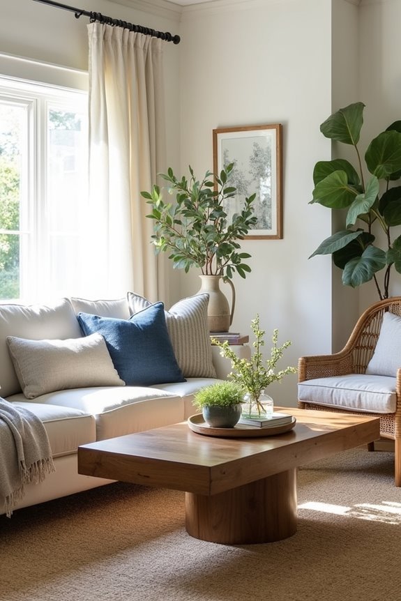
How do you soften the hard edges of traditional farmhouse style without abandoning what you love about it? I’ve found the answer in cottage principles. This blend brings warmth back into homes that felt a bit too stark.
Here’s what I’m doing in my own space:
- Swap straight lines for curved furniture pieces that feel inviting
- Layer warm neutrals—creams, taupes, soft grays—instead of stark whites
- Mix antique finds with contemporary pieces for authentic character
- Introduce natural, patina-rich materials like weathered wood and aged metals
When you let go of perfection, your home becomes a reflection of who you actually are. That’s where cottage warmth meets farmhouse practicality. It’s less rigid, more genuinely yours.
Durable Flooring for Every Farmhouse Vision
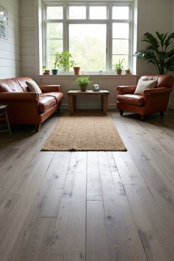
The right flooring can make or break your farmhouse aesthetic—and honestly, it’s one of the biggest decisions you’ll make in your home. I’ve learned that durable LVP flooring provides real advantages for maintaining that cozy farmhouse vibe without constant maintenance stress.
| Feature | Benefit | Style | Durability |
|---|---|---|---|
| Scratch Resistant | Withstands daily wear | Classic wood-look | Long-lasting |
| Fade Resistant | Colors stay vibrant | Authentic farmhouse | Years of beauty |
| Mold Resistant | Prevents moisture damage | Rustic charm | Kitchen & bath safe |
| 38+ Color Options | Endless design freedom | Your personal vision | Metroflor quality |
Metroflor visuals give you 38+ color options to explore. I recommend using their visualizer tool—it lets you preview farmhouse flooring in your actual space before committing. This practical approach means you’re investing in durability while preserving your personal style.